Time Matters
On the Temporal Dimension of Graphic Design

Graphic design objects are usually understood as static artefacts, defined by spatial rather than temporal dimensions. It therefore comes as no surprise that graphic design is generally not considered “time-based media”, a category that encompasses video, film, sound, and related works. Definitions of time-based media vary, but commonly revolve around duration. The Guggenheim Museum, for example, explains that works “are referred to as time-based media because they have duration as a dimension and unfold to the viewer over time”. However, if we take the notion of “unfolding over time” seriously, we might need to reconsider the exclusion of graphic design.
Graphic design does not unfold through movement or sound, but it does unfold through use. While design should not be reduced to its functional value, functionality remains an essential characteristic of design objects. Philosophers such as Daniel Martin Feige have pointed out that the aesthetics of design are always also the aesthetics of function and use. This implies that graphic design objects are experienced through use. And use necessarily requires duration. Think about reading a book or a small leaflet. Even posters, which are typically designed for brief exposure, demand a certain amount of time to be seen and understood.


In areas of graphic design that require particularly fast modes of engagement, the modernist principle of form follows function seems entirely appropriate. Understood as optimising design for efficient use, it produces aesthetics that tend to be slick and clean. This aligns with what the philosopher Byung-Chul Han describes as “Ästhetik des Glatten” (aesthetic of smoothness). Han explains that this aesthetic, which is characterised by immediacy and a condensed, accelerated present, is at the centre of “das Digitalschöne” (digital beauty), today’s most dominant ideal of beauty. He recognises this kind of beauty in a variety of artefacts ranging from smartphones to the artworks of Jeff Koons.
In graphic design, the ideal of “das Digitalschöne” can often be found in user interfaces, wayfinding systems, and emergency signals, all of which typically have efficient but also rather interchangeable designs. This is no coincidence. As Han argues, communication can only reach maximum speed where the same reacts to the same. When graphic design needs to be deciphered as fast as possible, there is no room for friction. The viewer should not be bothered with any novelties or irregularities. Instead, the design needs to feel intuitive, which is achieved by mimicking what is already established and thereby allowing for easy pattern recognition. Here we do not need to reinvent the wheel. Make the close icon an X, point in directions with arrows, and signal danger in red. Or, in other words, make it the same as what is already known.
This observation might come across as dismissive of design that is focused on short durations of engagement. That is not the intention here. Speed is simply a central need in some contexts. It should also be acknowledged that designing a functional navigation system is a genuinely difficult task and, in the case of emergency signals, getting it right can even be a matter of life and death. Nevertheless, acceleration comes at a cost. It does not allow for rich experiences and nuanced communication. This is no problem when there is no need for such things. However, when the ideology of speed colonises domains it should not, then complex ideas are flattened for instant consumption, printed matter is reduced to swipeable content, and certain aesthetic experiences are simply not possible.
In this context, it can be helpful to think of graphic design as translation, as Ingo Offermanns suggests. From this perspective, graphic design is about taking a statement from one language and communicating it in another (visual) language. Translations tend to become easier, and therefore faster, the closer the languages are related, because many underlying concepts, metaphors, and modes of thinking are shared. The more languages have in common, the less there is to actually translate. Following this logic, one might imagine that having only a single (visual) language would be ideal. However, as François Jullien explains: “A single language would be much more convenient, certainly, but it would also impose its uniformization. Exchange would be made easier, but there would be nothing, or nothing effectively singular, left to exchange.”
Jullien’s reflections on languages connect to what we have already identified through Han in graphic design: If there were only one visual language, communication would be so easy that it could reach its maximum speed, but at the cost of communicative depth. A consistent visual representation allows for fast recognition, but a greater variety of visual languages—though it may demand much more time to read and decipher—can communicate more nuances and details than a single representation ever could.


Take the visual depiction of a flower as an example. If the viewer has only a small timeframe available, a generic visualisation works best. Recognition becomes easy and fast, but the conveyed idea of a flower remains rather basic. If a larger timeframe is given, however, the viewer can engage with more rewarding depictions. A single, more telling image or a greater variety of representations can communicate qualities that a generic depiction never could. This is not about visual variety or complexity—since a single simple image can be just as compelling as multiple detailed ones—but about whether an image repays sustained attention. In the latter case, interpretation may not be immediate, but it can lead to a fuller understanding of what a flower is. Allowing for more time means allowing for deeper experiences. In contexts where this is the goal, friction is not a flaw but exactly where meaning emerges and a deeper beauty can unfold.


An example in print design that makes purposeful use of friction is the type specimen for Lucifer developed for an exhibition setting. Conceived as a large-format publication, it resists quick handling and cannot simply be picked up and flicked through. The oversized pages demand to be turned slowly and deliberately. Only upon closer inspection does one realise that it is not a bound volume but an almost fifteen-metre-long leporello, a single sheet folded into pages. The paper is neither rigid nor fragile, but thin enough to require attentive handling. The specimen’s scale and materiality introduce a subtle resistance that shifts the viewer into a slower mode of engagement, appropriate to what is presented.
Considering longer durations of engagement comes naturally when designing publications, since no one expects multiple pages to be read in an instant. However, a similar approach can also be beneficial when dealing with more ephemeral graphic design objects, such as posters. Conventional wisdom suggests that a poster must capture attention at first glance. But what comes afterwards? For a poster spotted briefly during a commute, the first impression may seem to be all there is. And yet, we rarely travel a route only once. If we consider more intimate settings such as shop windows, cafés, or building foyers, exposure can be long and repeated. Even when designing for seemingly short durations, focusing solely on the first impression might not be sufficient. The posters for Archdiploma and Salon skug are examples of how temporal considerations can inform ephemeral graphic design.

Archdiploma is the biennial diploma exhibition of the Faculty of Architecture and Spatial Planning at the Vienna University of Technology. The posters were displayed inside academic and architecture-related buildings, where people would encounter them repeatedly and could examine them up close. The large colour fields and title typography create an immediate visual presence. The design also rewards repeated and prolonged viewing: The colour fields reveal layers of aerial photography of Vienna and architectural details of the Funkhaus Wien. This embeds the exhibition venue into the visual language, and elements like the circular window and the “ON AIR” sign resonate with the public presentation of diploma projects.

The BAM! Wahlspecial poster for the cultural event series Salon skug demonstrates that designing for longer durations of attention does not necessarily require more details. It features a strikingly reduced motif: a bold symmetrical form that immediately catches the eye. But the image also rewards sustained looking. The longer one sits with it, the more the motif begins to oscillate between a pen pressing down to mark a ballot and an explosive energy radiating outward. In combination, this signifies the power of casting a vote and also resonates with the intense sound of the event’s music act. The two readings complement each other, and it is precisely the simplicity of the form that makes this possible. If the design were conceived only for the first glance, this depth would be unnecessary. It only becomes relevant when the temporal dimension is considered in the design.
The most meaningful encounters are rarely just for an instant.
Thinking about graphic design as a time-based endeavour opens up a much richer understanding of what it can achieve. Although graphic design objects are typically static, experiencing them always takes time, and their design should reflect that. Smooth graphics optimised for short exposure may be exactly what is needed in some contexts, but this optimisation comes at the cost of nuance and depth. Designing with longer durations in mind is not about being deliberately difficult or rejecting efficiency, but about recognising that some ideas and experiences require time to unfold. Think back to the last time a piece of graphic design left a lasting impression, and you will likely agree: The most meaningful encounters are rarely just for an instant.
Literature:
Feige, D. M. (2019). Design: Eine philosophische Analyse (2nd ed.). Suhrkamp.
Guggenheim Museums and Foundation. (n.d.). Time-Based Media. Retrieved February 27, 2026, from guggenheim.org/conservation/time-based-media
Han, B. (2016). Die Errettung des Schönen (4th ed.). S. Fischer.
Jullien, F. (2021). There Is No Such Thing as Cultural Identity. Polity Press.
Offermanns, I. (2022). Anti-Ambiguity vs. Translation. In I. Offermanns (Ed.), Graphic Design Is (…) Not Innocent (pp. 19 – 35). Valiz.
first published: 03.03.26
Content and Form
The Pitfalls of an Established Concept

Understanding graphic design in terms of content and form is common practice. Countless design curricula, creative workflows, and entire organisational structures are built around this concept. Many would even say that the whole purpose of design comes down to creating the proper form for a given content. We stumble upon this belief in everyday conversations, professional critiques, and bold statements by prominent design figures. Take the famous graphic designer Paul Rand as an example who—in an interview with John Maeda at MIT in 1996—defined design as “the method of putting form and content together”.
Although this view of design can seem helpful at times, it is ultimately flawed. It not only insufficiently describes how design communicates ideas, but more importantly, it is often at the core of what hinders the creation of excellent work. Instead of reducing design to merely finding a fitting form for a given content, we need to recognise it as the much more comprehensive practice of crafting expressions which—if done well—realise the desired communication.
To better understand the shortcomings of the content-form model and to get to a more robust alternative, we need to dip our toes into a bit of philosophy, linguistics, and semiotics, the study of signs and meaning.

In a literal sense, “content” refers to a substance contained within something else. This already hints at the specific notion of communication implied when speaking of content and form. The linguist Michael J. Reddy calls this foundational concept the conduit metaphor, meaning that communication is generally understood as a conduit system. As such, communication starts with a sender who takes the meaning they want to convey and places it into a container, such as an image, a word, or a sign. This container is then sent to the receiver who extracts its meaning by reading, viewing, or otherwise interpreting the transmitted vessel.

This assumes that content and form can exist independently of each other, much like a message that can be placed inside a container but does not necessarily have to be. However, if this were the case, we could alter the meaning of something without affecting its form or modify the form without causing even the slightest change in what it conveys. Moreover, we could encounter “pure content” or “meaningless form”. But is this truly how we experience communication? No, we do not. Content and form are inseparable. We cannot change the meaning of something without modifying the form. Likewise, altering the form is not possible without also affecting the conveyed meaning.


In workflows where content and form are treated as separate, content is typically prepared by others in advance, with designers expected to “add” the form later. Form is not only regarded as independent from content but also as less important. This leads to two major problems: First, it discredits design as a merely decorative project, something that can even be skipped if necessary. Second, it limits designers to work with only a part of what makes up the entire design. In such scenarios, designers are often challenged with unnecessarily difficult or even impossible tasks. They are asked to create striking posters with bland images, clear pictograms for ambiguous instructions, engaging presentations burdened by cumbersome writing, and similar. While thoughtful work on the form can surely do a lot of heavy lifting, form remains only one partial aspect of design.
As shown, describing design in terms of content and form leads to numerous challenges. It is an inadequate approach, especially when it reduces design to an exclusively form-related task. So what would be a better alternative?
The linguist and semiotician Ferdinand de Saussure can help us out here. At the end of the 19th century, he suggested that signs do not convey meaning through content that could be extracted from form. Saussure argued that meaning arises from how expressions differ from and relate to each other. Think about how something is defined in an encyclopedia. When you look up the definition of an expression, you will not find its “pure meaning”. Instead, you are presented with additional expressions related to your search term. These may be words, photos, diagrams, or something else. When searching for the definition of “tree”, you will find expressions like “plant”, “wood”, “trunk”, “leaf”, and maybe also a picture of a tree. It is through understanding how “tree” relates to all these other expressions that you can grasp its meaning.

Graphic design conveys meaning in the same way. Take the Austrian traffic sign for a “living street” as an example. Its exact meaning within the local traffic regulations may not be clear just by looking at it. However, we can still get a general idea of what the sign is supposed to communicate by exploring its connections and references to other expressions. We can easily recognise the shape at the top as a car and the one at the top right as a house due to their similarities to real-world objects. Thanks to our knowledge of how houses and cars usually relate spatially, we can conclude that the curved line is neither a ski nor a snake, but most likely the kerb of a road. The two figures playing ball are likely interpreted as an adult and a child, due to how they compare in size. The more connections we draw and relations we explore, the deeper our understanding of this design becomes. As our interpretation progresses, we will slowly figure out that this traffic sign indicates a residential area where people may be standing on the road, alerting drivers to be careful.

Another example of how meaning in graphic design is conveyed through references, rather than through content being “contained” in form, is the poster design for the music event “Salon skug”. Let’s focus on one particular aspect of this design: its typography. You might notice that the arrangement and sizing of the letters resemble a staircase viewed from above. At first glance, this might not seem significant. However, if you are familiar with the musician Ines Wurst featured on the poster, you will recognise this as a reference to one of her top-listened songs which tells a story set in a staircase. While such subtle references do not drastically alter the poster’s overall meaning, they contribute to a richer interpretation and, in doing so, enhance the design. Most importantly, this example shows once more that—whether obvious, subtle, or entirely hidden without prior knowledge—meaning is always defined by references.

Saussure’s model demonstrates that content and form are not relevant to how meaning is conveyed. Instead, meaning arises from the connections one can draw between expressions and the overall structure these connections create. Saussure’s and similar views therefore belong to a school of thought known as structuralism. Post-structuralism, with influential philosophers like Jacques Derrida, expanded on this idea. Derrida pointed out that Saussure’s model allows for a complete and definitive understanding of an expression if all its connections to other expressions are fully present in one’s mind. However, this is beyond what is humanly possible. Moreover, meaning is constantly in flux as connections evolve through reinterpretations, shifts in context, and the emergence of new expressions. As a result, the definitive meaning of any expression is unattainable. Meaning is always temporary and incomplete, shaped by the references one identifies and explores.
There are countless examples that illustrate how the meaning of an expression changes depending on the references present in different historical, cultural, personal, or other contexts. Let’s take the five-pointed star as an example. As a red star, it often signifies a socialist or communist worldview. In the EU and the U.S. flag, each five-pointed star stands for a member state. In the Pythagorean philosophy of Ancient Greece, it stood for health. At the Hollywood Walk of Fame, the star symbolises pop cultural success. In the Chinese flag, the five-pointed stars stand for the leadership of the communist party and the four social classes of China, as defined by Mao. In the metal music genre, the star is often displayed upside-down to symbolise evil or Satan, inspired by its similar use in occult contexts. The five-pointed star can also indicate a level of quality when rating products or services. These are only a fraction of the many varying meanings of this symbol throughout history and other contexts.

Derrida’s insights offer profound implications for designers as they point out fundamental limitations when communicating through design. While clear communication is often set as the goal in design, one must recognise that the way expressions convey meaning does not allow for absolute clarity. Even if designers are not limited to modifying only the form, they simply cannot dictate how their work will be interpreted. The best they can do is to include carefully selected references and consider the contexts of the audience to suggest the desired reading.
As we have seen, understanding design in terms of content and form results in various difficulties that ultimately make this approach inadequate. Rather than viewing design as the task of finding the “right” form for a given content, it should be seen as the practice of crafting expressions with thoughtful references that guide the audience towards the desired interpretation. Recognising references as central to communication highlights that design must go beyond form-related considerations. In practical terms, this means involving designers earlier in the process and granting them more influence over what is traditionally considered “content”. Although the desired communication can never be guaranteed, this provides at least more favourable conditions for creating meaningful work that leaves a profound impression.
Literature:
Maeda, J. (2016, November 14). Thoughts on Paul Rand. DesignObserver. designobserver.com/feature/thoughts-on-paul-rand/39426
Reddy, M. J. (1979). The conduit metaphor: A case of frame conflict in our language about language. In A. Ortony (Ed.), Metaphor and Thought (pp. 284 – 310). Cambridge University Press.
Derrida, J. (2010). Die différance. In P. Engelmann (Ed.), Postmoderne und Dekonstruktion: Texte französischer Philosophen der Gegenwart (pp. 76 – 113). Reclam. [Original work published 1968]
Leiden University – Faculty of Humanities, Victor Gijsbers. (2017, September 27). Chapter 5.4: Jacques Derrida, no one ever gets to clarity [Video]. YouTube. www.youtube.com/watch?v=3HFxAFMsxgk
Five-pointed star. (2025, January 13). In Wikipedia. en.wikipedia.org/wiki/Five-pointed_star
Pentagram. (2024, December 7). In Wikipedia. en.wikipedia.org/wiki/Pentagram
Pentagramm. (2024, August 1). In Wikipedia. de.wikipedia.org/wiki/Pentagramm
Cover:
“Content and Form” and “The Pitfalls of an Established Concept” set in Zapf Dingbats by Hermann Zapf
first published: 20.01.25
Expressing Ideas Through Typography
The Art and Craft of Typesetting and Type Design

One of the most straightforward ways of visually conveying an idea is to write it down for others to read. Now, as soon as it is about writing, we are in the literary domain, and there are countless exciting artistic, scientific, and philosophic perspectives to consider. Among all those, we want to focus on understanding writing, and more precisely, the usage of a writing system as a method of visual communication. Thinking of it as a first and foremost visual act invites us to put our usual literary criteria aside and instead discover the often overlooked yet immensely rich world of visual qualities that shape writing.
From a designer’s point of view, this shift in perspective means that we’re entering the domain of typography, the art and craft of setting type. In some definitions, the design of typefaces is considered to be part of typography as well, and for now, we want to use typography as this umbrella term that encompasses both typesetting and type design.
Some consider typography to be “good” when all technical parameters are adjusted to achieve the highest possible readability. Such an approach aims to make the text evenly spaced, pleasantly sized, harmoniously justified or ragged, clearly visually hierarchised, and so on. Understood this way, the typographer’s goal is to reduce any kind of friction that typography could potentially cause in communication.
“Typography in itself is capable of expressing ideas as an active and sometimes even the central component in visual communication.”
However, typesetting and type design go way beyond making a writing system visually accessible. Typography in itself is capable of expressing ideas as an active and sometimes even the central component in visual communication. It can visually tell a story even before a single word is actually read. If done well, typography is an interpretative act in which something is added to the ideas expressed within the writing. It is, therefore, not only about optimising the accessibility of the text but also about creating a communicative surplus.
This greater dimension of typography is something that others have already pointed at. In the seminal writing “Detail in Typography” by Jost Hochuli, for example, the Swiss designer talks about an atmospheric quality that a typeface can add to the design: “Once again, we encounter the phenomenon that typefaces—regardless of their optical legibility—trigger particular feelings on the part of readers simply through their appearance, and can have a positive or negative impact. This seems to be pragmatic evidence to show that, over and above their primary and essential task of acting as a visual means of transport for language, typefaces are also able to communicate atmosphere.” (Hochuli, 2008, p. 54)

An example of this can be given with Lucifer, a typeface that features an almost menacing appearance thanks to its sharp, exaggerated serifs. This specific aesthetic that a typeface like Lucifer brings with it has inevitably an effect on how the text is read. The design of the used typeface will introduce a specific tone of voice into the piece of writing through purely visual means. What otherwise could have been interpreted as rather calm and descriptive might be understood as something that is expressed in a much more alarming manner or even as a threat when set with Lucifer.

The communicative surplus of typography, however, is not only limited to this rather atmospheric quality that a typeface might convey. The choice of typeface can also introduce a historical reference that situates the text. Lucifer, for example, is based on Robert Stöcklin’s hand-lettering for a poster design he created in the 1920s in Switzerland. Now, whenever something is set in Lucifer, it is connected to this specific time and place the typeface is based on.

In the book “Baslerische Landsitze – einst und jetzt” (in English: Basel Country Estates—Then and Now) the typefaces Genath and Neue Haas Grotesk were chosen to fit and emphasise the topic of the publication. The book is an annotated and expanded reprint of a historical art portfolio with detailed, hand-coloured woodcuts of country estates in and around Basel. Thanks to the choice of typefaces, not only the topic of the publication but also its typography are deeply connected to the history of Basel, as both typefaces Genath and Neue Haas Grotesk are linked to Basel’s Genath Type Foundry from the second half of the 16th century which was later renamed to the well-known “Haas’sche Schriftgiesserei”.


So far, the mentioned examples only demonstrate the communicative potential of type design and/or the conscious choice of typefaces. However, the typesetting itself—regardless of the used typeface—can express ideas as well. This can work through rather minor typographic design decisions as exemplified by the numbering of the country estates shown in Baslerische Landsitze. The individual numbers are framed within a specific shape and set next to the corresponding name of the country estate. This way the numbers look similar to the traditional enamel plates that designate the house number of a building. As a result, the typesetting suggests a particular idea of how one should experience the reading of the book, namely as a metaphorical stroll through the streets in and around Basel, Switzerland.
However, there are not only these small decisions in typesetting that add one or the other reference to the design. There are also typographic designs that are much more comprehensive. The Future Tense, a publication that accompanied Russell Perkin’s art installation of the same name, is a good example of this. The sound piece is based on the oldest surviving polyphonic requiem and deals, among other things, with the lack of space to mourn those who passed away in the recent pandemic. The artwork was exhibited in a large, elongated space, a setting reminiscent of a cathedral that visitors could freely roam through to experience the piece.


The typography of the publication was inspired by the artwork itself as well as its particular exhibition setting and essentially used them as the source for a metaphorical design concept. Both of the essays contained in the publication were set in parallel referring to the polyphony of the requiem. The shapes of the paragraphs were purposefully modelled after typical ground plans of cathedrals through which the writings appear to be roaming through. Also, just like Russell’s piece, there are fragmentations and stuttering within the typesetting. This occasionally results in rather empty pages that reflect both loneliness and the much-needed spaces to mourn the ones we lost. And lastly, the cover design of the publication represents the multiply framed and decorated main entry of cathedrals, hence the typesetting and repetition of the title The Future Tense.


There are countless more examples to demonstrate how typesetting and type design can be used to express ideas. The chosen projects should illustrate the wide range of possibilities that lie here and show that it is always worth considering the communicative potential of typography. When designing, one should not stop at—by all means important—questions of accessibility but go further and express ideas through typography itself.
Literature:
Hochuli, J. (2008). Detail in Typography. London: Hyphen Press.
last edited: 10.07.24
first published: 18.05.22
Visualising Utopia
On Creative Means Against Lost Futures

During the COVID-19 pandemic, doing the right thing meant adapting to a different way of living. Especially in the very beginning, the drastic change of everyone’s lifestyles was almost univocally accepted as it was the proper way to react to the previously unknown but potentially deadly virus. Some of the measures included the cancellation of travel plans or in-person meetings and events. This went along with a big shift towards the digital realm that helped us to socialise while not having to be physically present at the same place. We started to wear masks in public and disinfect our hands much more frequently. Taking the global economy into the picture, we witnessed a significant downscaling of the enormous efforts in production, transportation, marketing, and so forth. This is remarkable as it showed that one of the most central environmentalist demands, which are usually put down as totally unrealistic and economically unthinkable, is in fact very much feasible. These and many other things changed almost overnight, making it painfully obvious that the world we are living in is contingent. There are alternatives to the way things have become, and living in this or a radically different world is only a matter of collective choice.
“There are alternatives to the way things have become, and living in this or a radically different world is only a matter of collective choice.”
While these changes in our lives were widely accepted, it is worth taking into account that they were mainly tolerated as temporary measures. The longer people had to keep their distance and do without a lot of what makes their lives worth living, the stronger the longing to go back to “normality” became. Yet, some more visionary thinkers saw a unique opportunity now that Margaret Thatcher’s dominant paradigm of “There is no alternative” was disproven by a virus. They saw the ideal time to imagine and eventually shift towards a different future rather than just going back to “normal”. And there are good reasons to do so. May it be for environmental, social, or political reasons, simply continuing with the “normal”, pre-pandemic life can in many ways be considered highly problematic. So why not take this unique situation as an opportunity to change things for the better?

In pre-pandemic 2019, the Academy of Art and Design in Basel held a symposium called “future sense” to address the question of how artists and designers can contribute to a sustainable future. One of the speakers, the futurologist and sociologist Harald Welzer, pointed out that modern society seems to have lost any idea that it could be different, better than it is. It is a society that no longer has a horizon of desire but already seems to have its future behind it. However, this was not always the case. At some point on the way to the 21st century, futures must have been lost, so to speak. Welzer’s diagnosis of the lack of visionary ideas in today’s “futureless society”, echoes the observations Mark Fisher shares in his seminal writing “Capitalist Realism”. He remarks that apparently “[i]t’s easier to imagine the end of the world than the end of capitalism”. The task of the utmost urgency for Welzer is, therefore, the “reintroduction of the future” or, in other words, to get people to imagine a different, better world ahead of us. He sees a possible solution in the creation and visualisation of realities that have a concrete connection to the lifeworld and situation of its contemplators.
“These images [of desired futures] are essential as they make alternatives visible, better worlds imaginable, and motivate to take action.”
As the pandemic disrupted our everyday life, many started to question the status quo and ponder over the kind future they truly desired after the pandemic would be over. For some people their reflections manifested themselves through visualisations of speculative worlds and settings. Such images are probably one of the most crucial ways of contributing to a better world. They should not be mistaken as merely decorative, visual side notes to the supposedly more important non-visual thoughts and ideas about the way we live. These images are essential as they make alternatives visible, better worlds imaginable, and motivate to take action. Just like Fred Scharmen points out in “Space Settlements”, to name just one example, images are an often underestimated catalyst to get people going. His book retraces the impact of Rick Guidice’s and Don Davis’ speculative illustrations and shows how these images motivated and inspired a wide range of architectural research and scientific work on artificial space habitats.

When creating such impactful images, it is worth mentioning that the depicted alternative world only needs to be different, not necessarily better. As long as people are able to relate to these altered realities, they can get inspired by them and eventually overcome their lack of imagination of a better future. The onlookers will either imagine the presented realities further or even create their own positive images of the future. For designers, this is exciting as shaping new, divergent worlds and making them not only visible but also approachable can be understood as a design task at its core. The futurologist Welzer agrees with this observation as he too sees designers in a decisive role.
“To create images of alternative futures means nothing less than visualising utopia.”
To create images of alternative futures means nothing less than visualising utopia. According to the political scientist and dedicated expert on utopia Thomas Schölderle, “utopia” is first and foremost a means to criticise the status quo. The critique is given by presenting a rational fiction of an alternative world that differs from the actual world in all the aspects it considers in need of improvement. It is therefore crucial to note that utopia, unlike our common understanding, does not necessarily need to be a better or even perfect world. It only needs to be different in the aspects it wants to criticise. A dystopian world that differs in making some aspects worse, often by taking a tendency given in the actual world and pushing it to the extreme, is not the opposite of utopia but a variation of it. On the other end of the spectrum of utopias are the ideal, perfect worlds which are called “eutopias”.
No matter if the alternative world is dystopian (bad) or eutopian (good), visualisations of such rational fictions can be achieved in numerous, sometimes unexpected ways. When researching examples, we could identify nine different strategies to visualise utopias:
— Spatial Plan Drawing
— Spatial Illustrations and Renderings
— Modelling
— Object Design
— Prototyping
— Forged Evidence
— Chronicles
— Depicting Lifestyles
— Documentary Photography
To illustrate the range of approaches used by creatives, we decided to pick three examples that relied exclusively on one of those strategies and point at one of our projects that combined multiple approaches.


The first example of visualising an alternative world is Manuela Pfrunder’s atlas “Neotopia” in which she depicts a world with radically equal distribution. She drew maps that show how the world would look if everyone had the same access to water, mountains, forests, meadows, urbanised land, and so forth. She extends this way beyond geographical aspects and shows what it would mean if resources like coffee, cacao, cheese, sugar, fish, meat, and similar would be distributed equally as well. She even goes as far as imagining what an equal distribution of human suffering as in hunger or political persecution would look like. This makes Neotopia a striking critique of the existing inequalities in our current world. At its core, the atlas shows a different reality through visualisation of spatial relations. For that reason, it is a perfect example of the visualisation strategy “spatial plan drawing”, a particularly helpful approach as soon as concrete numbers are used to explain the alternative world.


Another approach to visualising utopia is to prototype objects that inhabit the utopian world one is imagining. There are numerous interesting examples of this in the domain of speculative design. One of those would be a set of objects created by the designers James Chambers and Tom Judd. They asked themselves how the famous British wildlife filmmaker David Attenborough would have designed everyday objects if he would have become an industrial designer. Under the name “Attenborough Design Group” they started to create prototypes that use self-protection mechanisms from nature. One result was “The Gesundheit Radio”, a radio that sneezes to free itself from accumulating dirt as soon as it gets too dusty. Another object was the disc drive “Floppy legs” which jumps on its little mechanical feet as soon as liquid is spilled near it. The third object was the “AntiTouch lamp” which protects its sensitive light bulb by moving away as soon as someone or something is getting too close. By creating this sophisticated, speculative technology, the designers show us a world that is sustainable and eco-friendly. Instead of planned obsolescence which purposefully shortens the lifespans, the devices have built-in mechanisms that make them last longer. It is therefore an indirect critique on the fast-moving and wasteful nature of today’s electronic devices which is heavily contributing to the current ecological crisis.


A third strategy for visualising utopia is the use of documentary photography. The example we want to show here might be unexpected, yet insightful as it demonstrates the wide range of what creating images of alternative worlds and possible futures can mean. Photographs can document numerous things. Depending on what is shown they can evoke strong, maybe even shocking or disturbing reactions. Being aware of the effects photographs can have, Martin Luther King and the Southern Christian Leadership Conference (SCLC) organised a nonviolent direct action protest against racial segregation in 1963 in Birmingham. Back then, the city of Birmingham was known for being one of the most racist places in the United States. The organisers chose this place purposely because they knew that the situation would likely escalate, get violent, and result in striking images of white brutality and violence against black people. And as the photographs from the protest, unfortunately, show, this is exactly what happened. For the city of Birmingham, the photographs might just depict the way things actually were. However, for many other places in the U.S. and beyond, where such extreme racism was not common, it was a glimpse into a dystopian world. It was a threatening image of what might become the reality in other places too if the injustices against the black community and the manifold acts of racism would not be counteracted. As such, it was a powerful visualisation of a dystopia that got people to stand up for a better future.


The projects above and numerous other striking examples show that there are many ways of creating visualisations of alternative worlds and futures. They are not about some Sci-Fi world-building for the sole purpose of entertainment but have an impact that goes way beyond. They are visualisations of utopia and as such get people to imagine and eventually contribute to a better world. Lastly, we want to point at a project in our portfolio: SWISSTOPIA AUTOMATA. Multiple approaches were combined to create a report that visualises a utopian Switzerland beyond the labour society as we know it. Have a look at the → project documentation.
Literature:
Dunne, A. & Raby, F. (2013). Speculative Everything: Design, Fiction, and Social Dreaming. Cambridge: The MIT Press.
Fisher, M. (2009). Capitalist Realism: Is There No Alternative?. United Kingdom: John Hunt Publishing.
Pfrunder, M. (2002). Neotopia: Atlas zur gerechten Verteilung der Welt – Atlas of equitable distribution of the world. Zürich: Limmat.
Rogger, B., Voegeli, J. & Widmer, R. (Eds.) (2018). Protest: The Aesthetics of Resistance. Zürich: Lars Müller Publishers.
Scharmen, F. (2019). Space Settlements. New York: Columbia Books on Architecture and the City.
Schölderle, T. (2012). Geschichte der Utopie: Eine Einführung. Köln: Böhlau.
Welzer, H. (2019). Alles könnte anders sein: Eine Gesellschaftsutopie für freie Menschen. Frankfurt am Main: S. Fischer.
German versions of this article were published at ↗ FUTURZWEI and at ↗ skug.
last edited: 10.11.21
first published: 07.09.21
Communicating Expertise
Insights from Doing Graphic Design for Experts

When asked about what we do at Nguyen Gobber, we usually answer something along the lines of: “We help people by creating compelling appearances for their knowledge and ideas.” A more straightforward term for those, whose knowledge and ideas are worthwhile to be communicated, would probably be “experts”. So, if you want to boil our answer down to the shortest possible version, it would be: “We help to communicate expertise.” And we do so because expertise does not matter too much if you are not able to communicate it properly. There is no meaningful impact to be expected if nobody takes notice of your skills and knowledge and gets access to your insights.
“There is no meaningful impact to be expected if nobody takes notice of your skills and knowledge and gets access to your insights.”
In our practice, we had the chance to gain some insights into how one can communicate expertise best, and, in the spirit of the statement above, we want to share it. From our own experience of doing graphic design for experts from the academic, cultural, and social fields, we learned that there are a handful of ideas and aspects that are particularly helpful when crafting your communication. They are relevant, no matter what type of expertise you want to convey. In fact, these insights are even applicable to other types of communication beyond graphic design, as long as they remain unidirectional, meaning that there is no back and forth, no opportunity to respond and clarify.
Just like in any other endeavour, one should first get a basic understanding of the situation they are dealing with. In our case, we need to define expertise so we can pinpoint what we are exactly trying to communicate. Expertise can be understood as what distinguishes an expert from a novice. This does not tell us too much, though. So we want to determine the decisive factor that makes someone an expert. If you open a dictionary, you will read that an expert is a person who represents “mastery of a particular subject”, “someone with special knowledge and skill in a particular domain”, or that an expert is “somebody who has a broad and deep competence […] in a particular field”. No matter the phrasing, it is the surplus of knowledge and skill that makes someone an expert. Hence, it is also this surplus that we are referring to when we are talking about “expertise”. It is worth noting, though, that in practice we tend to only call someone an expert if it is not only a slight but a significant surplus of knowledge and skill.

This definition of expertise, however, is not absolute but relative. Expertise is determined by comparison and therefore the reference group matters. Depending on the reference group you consider, the person with a significant surplus of knowledge and skill in a given subject might change. A primary school teacher might be the expert in maths within the class they are teaching but not at an international conference on advanced mathematics. This relativity of expertise implies not only that the role of the expert may wander but also that the threshold which differentiates common knowledge from expertise can change depending on the context. This has consequences for the communication of expertise as well. For graphic designers, it goes without saying that visual communication needs to be tailored to the target audience in mind. When communicating expertise, the design has to keep the reference group in mind and be adjusted accordingly, as they are decisive to whether the subject matter you want to convey can even be considered expertise.
“Expertise is determined by comparison and therefore the reference group matters.”
Communicating expertise, especially when looking at the visual domain, is not limited to designing aids that help to explain a subject, such as an infographic, an article, a research poster, and so forth. In fact, a lot of visual communication of expertise must have inevitably already happened before these kinds of visual explanations get relevant. It is the kind of visual communication that signals expertise and thereby guides those who are interested. Just think about it: Before you buy a book, you look at its cover. Before you hire a consultant, you visit their website to learn about them. Before you book tickets to a conference, you read the event flyer. Consciously navigating to a source of expertise is only possible if you are literally looking for it. Hence, carefully designing what one will be looking at is crucial. If the first contact point does not clearly signal expertise, the onlooker will not realise that they just found the path to the expertise they were looking for.

Now, expertise does not have a colour, shape, or specified dimension. However, there are a few associations that commonly go along with experiencing expertise. In our design work for experts, we try to evoke these associations. This way, expertise is signified through a visual communication design that is consistent with what it refers to. One of these common associations is expertise usually being perceived as something of high value. For that matter, visual communication of expertise generally avoids looking cheap, which is why you probably will not find a PhD thesis published as a stapled booklet. Also, there is a certain confidence associated with expertise. That's why one can be equally confident in their design choices when communicating expertise, as long as there is a good argument backing it up.
“If the first contact point does not clearly signal expertise, the onlooker will not realise that they just found the path to the expertise they were looking for.”
However, the number of these broadly known, general signifiers of expertise is very limited. In many cases, we need to take our time to get a better understanding of the subject matter so we can determine fitting signifiers of the concrete instance of expertise at hand. Our poster for the FHNW lecture series “Wir Sind So Frei!” (German for: “We are so free!”) could be an example of such a contextual signifier. The lecture series discussed problems and insufficiencies connected to various concepts of freedom. In our design, we playfully explored the spatial and grammatical limits of “freely” rearranging the words which form the conference title. This way, the design itself visualises the debated problem and thereby references the critical thinking that recognises this issue and the enhanced self-reflective capabilities which the invited experts – most of which were from the philosophical domain – are known for. Determining such more contextual signifiers of expertise and incorporating them into the design is especially rewarding as they are usually the most convincing.
Once the interested are guided to the source of expertise they were looking for, it is time to craft communication that facilitates the transfer of knowledge. Expert knowledge is usually complicated enough on its own. Therefore, its communication needs to be as clear and easy to follow as possible while not getting too boring and dull to look at. It is a challenging task to provide visual clarity without sacrificing engaging aesthetics. Crafting something that strikes this balance is not easy. It requires skilled and experienced designers to get such a job done, so the necessary resources need to be allocated to afford them. Unfortunately, more often than not decision-makers do not account for this and as a result, we have to witness how accessing valuable knowledge is hindered by poor graphic design.
“Expert knowledge is usually complicated enough on its own. Therefore, its communication needs to be as clear and easy to follow as possible while not getting too boring and dull to look at.”
There is an argument to be made that, especially in the scientific domain (and here most of all in natural sciences), the perceived complexity does not stem from the subject matter but from the terrible visual communication that makes the presented knowledge unnecessarily inaccessible. If the compositions are chaotic; gestalt principles are disregarded; visual hierarchies are unclear; every corner is plastered with visual clutter as if designing a layout is a game of Tetris; and so on; then the onlooker is occupied with making sense of the visual mess instead of learning about the subject which should have been communicated. Obviously, such design mistakes are often the result of a layperson at work, so we do not want to judge their efforts too harshly. [Side note: We made a ↗ helpful guide to designing better research posters.]
The last thing we want to mention as something we have experienced as helpful when communicating expertise is to apply one of the most well-known writing techniques to the domain of visual communication, namely “Show Don’t Tell”. It is a technique used in various kinds of texts to allow the reader to experience the story through actions rather than through the author's description. So, instead of simply writing that the hero is brave, this technique would suggest demonstrating it by telling the story of how the hero faced the threat while everyone else was running away. In our context, this technique basically says that one should not just claim expertise but prove it.


In “An der Grenze der Lesbarkeit”, the knowledge of the borders of readability and the potential quality in design one can achieve by working at its fringes is not only described in written form but also demonstrated in numerous visualisations throughout the publication. Even before the onlooker opens one of the two books to read and learn about this topic, they can witness the expertise in action when looking at the cover design. The title got split into multiple syllables and playfully spread across the spines of both books. This typesetting at the border of readability creates an appealing cover design and thereby proves the expertise the reader can expect to learn from when reading the book. While this example shows how beneficial it is to not only claim but prove expertise, it also needs to be mentioned that on many occasions this is not possible. Sometimes the medium one is using simply does not allow one to demonstrate the type of expertise one is dealing with. In any case, though, it is worth looking for opportunities to demonstrate the communicated expertise in the design itself as this hardly fails at achieving truly compelling results.
We can summarize our insights in four questions that we have learned to ask ourselves whenever we need to communicate expertise:
1 – What exactly counts as expertise in this specific context and therefore needs to be communicated?
2 – How can we authentically signal said expertise to guide the interested to the source?
3 – How can we achieve the necessary visual clarity to make expert knowledge accessible without looking dull?
4 – How can we demonstrate the relevant expertise within the design itself rather than just putting some claims out there?
Finding answers to these questions in the design process has proven to consistently yield better results when communicating expertise.
last edited: 19.02.23
first published: 21.06.21
Metaphorical Thinking in Poster Design
How a Cognitive Theory Brings About Better Graphic Design

Metaphorical thinking or metaphorical concepts play a central role in political communication. Most often, when you hear about an issue being presented in a certain light, this is done with the help of a conceptual metaphor. Depending on your political point of view, for example, you might describe taxes as a financial burden or a virtuous way to give back to those who helped you grow. Speaking of a “burden” frames taxes as unnecessary weight you are forced to carry, something holding you back when trying to achieve your goals. In contrast, the metaphorical framing of “contribution” shifts the perspective and makes paying taxes appear like a virtue. Either the virtue of helping those in need or the expression of gratitude by giving something back to the system that enabled you to prosper.
“What makes those metaphors so powerful is that they provide conceptual systems that guide our way of thinking.”
It is important to recognise that a metaphor in this context is not understood as a mere figure of speech but as a way of conceptualising things. It is not that we are just substituting the word “tax” with “burden” or “contribution”. A conceptual metaphor goes way further. It is a conceptual system that guides our way of thinking. “Burden” might be just one singular expression, but it activates a whole set of corresponding ideas that include aspects like “weight”, the feeling of being “dragged down”, and hindered from “moving forward” in your “journey” of life.

Thinking of taxes as a burden frames them as negative and something that should be “taken off of our shoulders”. Once caught up in such a metaphorical framing, it gets difficult to form any opinion that contradicts the inner logic of the metaphor. If you’re on a journey, any additional weight is simply a burden. Clever politicians and PR consultants know the power of conceptual metaphors like these very well. They use them in more or less noticeable ways to influence their audience’s opinions. Once you know about these conceptual metaphors, you start noticing them everywhere. Just think about prominent terms and expressions used in today’s political debates. You might have heard of “waves of refugees”, “war on terror”, “global warming”, and others.
“We can spot a metaphorical design concept, when we can describe the design in terms of ‘X as Y’, meaning that something (X) was designed as if it were something else (Y). In countless cases, it is exactly this conceptual structure, that makes the design so intriguing.”
In cognitive sciences, there is the so-called conceptual metaphor theory which tries to explain these ways of thinking. The theory was first popularised in the late 1980s and has been further developed ever since. In the foundational book “Metaphors We Live By” by George Lakoff and Mark Johnson, the essence of metaphorical thinking is boiled down to “understanding and experiencing one kind of thing in terms of another” (Lakoff & Johnson, 1980, p. 5.). Even though the focus has been put on political communication so far, the given definition of metaphorical concepts allows us to find them in other areas as well. One of the most interesting contexts to look for conceptual metaphors is the domain of graphic design. We can spot a metaphorical design concept, when we can describe the design in terms of “X as Y”, meaning that something (X) was designed as if it were something else (Y). In countless cases, it is exactly this conceptual structure, that makes the design so intriguing. More often than you might think, purposely understanding the design, whether in its entirety or only in parts, in terms of something else has led to truly original results. Let’s have a look at a few examples.


What would happen, for example, if we would conceptualise the poster as a city map? Ralph Schraivogel showed us when he created the poster design “Woody Allen” for Filmpodium Zürich. For his poster, he took the layout of Woody Allen’s city of choice, New York, as the main reference to guide his design. The typography was set along streets as if they were street names while portrait images of Woody Allen were positioned as if they were the buildings and parks of the city.
In a campaign designed for Roventa’s new curling iron, the designers of Publicis worked with a different metaphorical design concept to create an equally creative design. The campaign’s title “Curls” (the original title in German is “Locken”) already gives away the point of reference for this original design solution. Instead of developing a visual design, the designers decided to conceptualise the printed matter itself as curly hair and shaped it accordingly. This led to a truly unexpected, yet highly original design solution that surely got remembered.
One further example to underline the creative potential of metaphorical thinking can be seen in Claudiabasel’s posters for S AM, Swiss Museum of Architecture. The typographic composition was organised as if it were a building, starting with the most fundamental piece of text, the wordmark S AM, at the bottom large and strong. On top of it followed the exhibition title in a smaller size, its subtitle in an even smaller size, and so on. The typography was built up from the bottom up, mimicking the architecture itself. The metaphorical concept of “Typography as Architecture” guided the design process and led to an unconventional yet perfectly fitting graphic design for an architecture museum.

Being familiar with the conceptual metaphor theory helps to identify these kinds of designs and provides the vocabulary to describe them. Likely, these designers were unaware that there is a theory out there describing the specific structure of their design concepts. Now imagine if such design concepts were not just discovered by chance, but if one could develop such design ideas through a dedicated method grounded in conceptual metaphor theory. In “Designing in Metaphors” (in German “Gestalten in Metaphern”), we dig deeper into the conceptual metaphor theory in graphic design and outline a method for developing metaphorical design concepts tailored to your projects. This method, first introduced in the book, has since become a reliable tool we regularly use in our design practice.

When we first developed this approach, we created a series of posters as a proof of concept. They visualise an early, yet fundamentally sound version of the method. One of the poster designs takes the definition of a method as its point of reference. A method is defined as a series of steps to take to reach the desired goal. “Proceeding step by step” became the guiding conceptual metaphor for this design. The typographic composition is arranged according to the idea of “taking steps”. The figures 1 to 5 not only indicate the actual steps of the method but are also typeset to follow the visual logic of ascending steps, leading toward an “elevated” result.

Another metaphorical poster design we developed with our method is centred around the theme of “lighting up”, which is frequently used to represent coming up with or understanding ideas. Just think about the glowing light bulb often used to illustrate this in cartoons or literary expressions like “having a bright idea” or “an illuminating talk”. We decided to use this metaphor and design the poster according to the process of something lighting up or getting brighter for a convincing presentation of the inspirational purpose of the method.

Many sketches tried to visualise this motive by creating compositions in which a dense, dark structure in one or multiple areas of the format opens up and transitions into white space. On many occasions, this coincided with a playful treatment of contrasts within the poster design. The final design does not only feature lines that represent light rays but also a composition in which said lines are positioned with increasing density from bottom to top. This effectively produces a brightness gradient that dominates the poster design as a whole. In addition to these graphical elements and their composition, the poster was printed on fluorescent paper as a further reference to the core theme of “lighting up”.

The posters of other designers presented earlier and those we created to test our method demonstrate the great potential lying in metaphorical design concepts. For sure, the visual formulation and implementation can succeed or fail independently of the initial design concept. However, using our method to generate fitting metaphorical concepts provides an ideal foundation for visual explorations. A strong metaphorical design concept guides the creation process, makes creative decisions easy to take and keeps the design deeply connected with the core of whatever it communicates. It can be the very thing that enables you to create meaningful visual expressions instead of arbitrary, trend-driven, and eventually ineffective designs.
Literature:
Lakoff, G., & Johnson, M. (1980). Metaphors we live by. Chicago: University of Chicago Press.
last edited: 31.01.24
first published: 16.01.21
A School’s History Reflected in Design
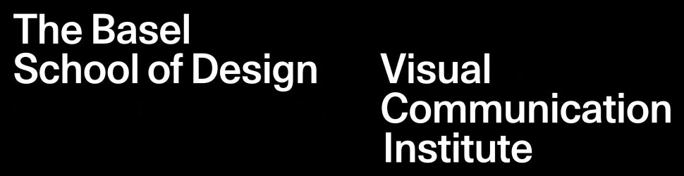
The Basel School of Design Campaigns 2019/2020

In 2019, the Visual Communication Institute [today: Institute Digital Communication Environments (IDCE)] of the Academy of Art and Design in Basel commissioned the conception and design of a campaign. The goal was to generate more interest for both of the postgraduate programmes offered at the institute. One of them was the Master of Arts in Visual Communication and Iconic Research [today: Master of Arts in Digital Communication Environments], which connected the practical knowledge and methodology of visual communication with the scientific domain by developing new approaches in image research. The other postgraduate programme was the International Master of Design UIC/HGK, mostly referred to as MDes. It was a collaboration between the Visual Communication Institute in Basel and the University of Illinois in Chicago. It gave students the unique opportunity to graduate with an internationally accredited Master of Design from UIC and the Swiss equivalent, a Master of Arts. Both of these programmes shared the same heritage as they evolved from the renowned Basel School of Design. For that reason, the institute decided to choose the title “The Basel School of Design” for their campaign. This put emphasis on a very specific design tradition born in the late 1960s in Basel, which was also one of the main points of reference for the conception of the campaign design. So, what exactly is this design tradition?

Back in 1968, Armin Hofmann and Emil Ruder conceived a postgraduate programme at the Basel School of Design, the Weiterbildungsklasse für Grafik / Advanced Class for Graphic Design. It offered an intensive study of design principles and a very influential, form-related design methodology. The programme attracted students from all over the world and became an outstanding model for a modernist design education. The designs developed at the school were the results of a process-oriented approach in which many variations were created and thoughtfully compared with each other. After sequentially improving said variations, the final design oftentimes featured a clear formal expression of an underlying idea combined with a reduced colour scheme and matter-of-fact typography. This style in design, which is now referred to as “Swiss Style”, would become world-famous and so influential that iconic pieces of graphic design such as the wayfinding system of the New York Subway or the corporate design of Lufthansa are in many ways shaped by it. While “Swiss Style” certainly was not solely created by a handful of people in a small Swiss town, many experts would still point to the Basel School of Design and the designers associated with the programme when asked about its birthplace.

The first design developed for the campaign in 2019 played with the idea of those extensive variations typical in the design process taught at the Basel School of Design, by experimenting with one, if not the most, basic shape, a circle. Such a series of slight or more drastic formal variations was not only typical at the Basel School of Design back in the late 60s and 70s but also one of the preserved traditions in both postgraduate programmes offered at the academy. As the variations for the intended campaign design in 2019 seemed a bit too arbitrary, Prof. Michael Renner, who was involved from the commissioner’s side, proposed to create variations of visualisation for the idea of friction. Even though it was not intended first, the topic “friction” was quite fitting as it pointed towards crucial aspects of the history and development of the Basel School of Design.
“The designs developed at the school were the results of a process-oriented approach in which many variations were created and thoughtfully compared with each other.”
While Armin Hofmann and Emil Ruder had been teaching design very much according to modernist standards, a later protagonist of the Basel School Wolfgang Weingart popularised a different take on graphic design, specifically in regards to typographic treatment. It was an incident of friction between an established approach and a new way, which would later be described as New Wave or Swiss Punk Typography. In many ways, Wolfgang Weingart broke with the preceding modernist understanding of design and implemented a postmodern approach. The idea of “good” (typographic) design shifted while the strong focus on the formal qualities and a design process involving an abundance of variations was maintained. Later, when Prof. Renner took over the direction, he was involved in transforming the programme into an academic degree course, the Master of Arts in Visual Communication and Iconic Research. By doing so, he again caused an incident of friction as he shifted from the form-focused programme to a more intellectual study of imagery with the ambition to use the methodology of the Basel School of Design as a tool for scientific research.


In addition to referencing the variations-driven design process of the Basel School of Design, the theme of friction became relevant to the campaign design. Different notions of friction were defined as points of orientation, and multiple series of abstract, geometric illustrations were then developed to visualise the different facets of friction. While the output was rich in formal variations, the colours were reduced to greyscale to reflect the iconic style of the Basel School.

The design was then combined in a composition to be used as the key visual for the main component of the 2019’s campaign, a foldable poster that was sent to different academic art and design institutes. The design featured a rigid layout in which the various visualisations of friction were placed. On the back of the poster, information on The Basel School of Design and both of the postgraduate programmes were set within the same grid system. The foldable poster was printed with silver instead of grey, which led to a very specific visual quality that is unfortunately mostly lost in the digital reproduction of the prints. Apart from this centrepiece of the campaign, many further applications such as an animation, graphics for social media, and printed advertisements were designed. The effort proved to be worth it as the campaign successfully increased the number of applicants for that year.


For the 2020’s edition of The Basel School of Design campaign, the theme of variation was revisited. This time, however, the second theme was the question of visual identity instead of friction, which shifted the focus from a reflection of the historical development of the institute towards its current state. Interestingly, the Visual Communication Institute which was the academic successor of the original Basel School of Design does not have its own visual identity. There was only a corporate design of the FHNW University of Applied Sciences and Arts, of which the Visual Communication Institute was a part. This loss of an independent visual appearance coincided with a broadening of visual styles that were taught and produced at the academy. The key visual reflected this circumstance in a playful way by showing a rich pool of plausible but also absurd logos.


The logos were again shown as parts of a series of variations and put together to create the key visual. This time, however, the strict layout and rigid grid were abandoned to create another visual reference to the wild proliferation of styles and design approaches that were and still are visible at the academy. The reduced colour scheme of only black and white as well as the strict typographic layout on the back side of the poster remained so that the hint towards the roots of the Visual Communication Institute was still given. Just as the year before, many further design applications apart from the poster were implemented. Altogether, the 2020’s iteration formed a successful continuation of the series of annual campaigns for The Basel School of Design.

_Wellcome_V0044747.jpg)
last edited: 22.09.21
first published: 16.01.21